We’ve been busy making improvements to the reports subscribers can generate using Analyser. Just one more improvement to your due diligence and suitability process available through Analyser.
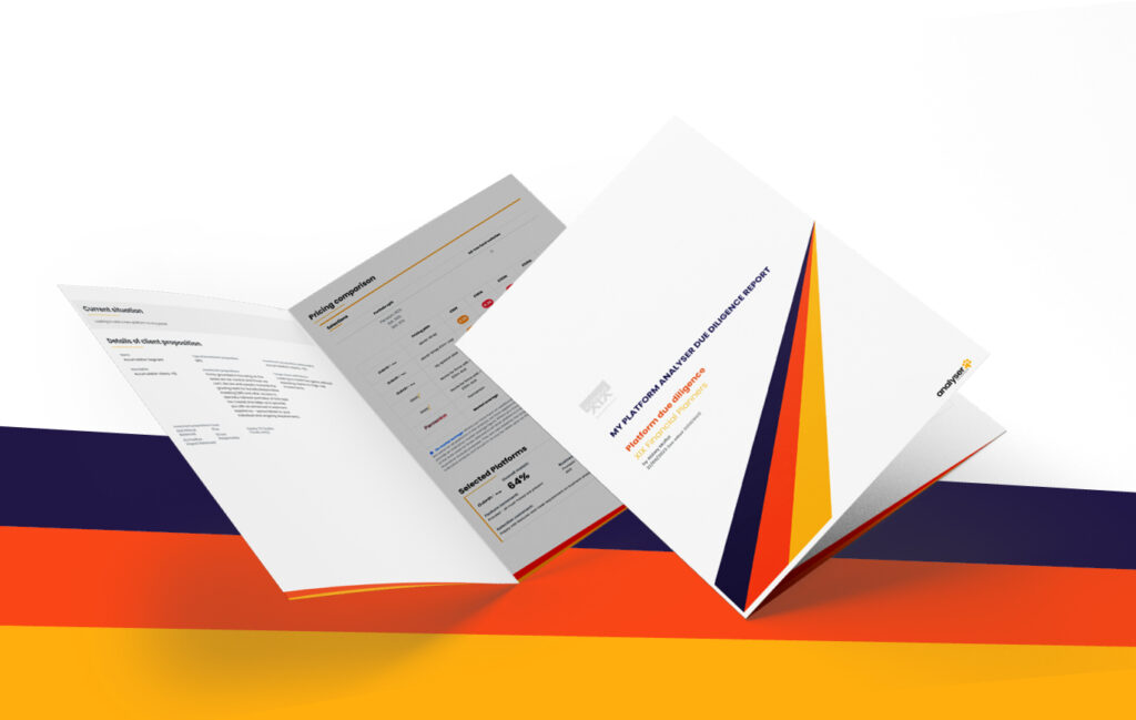
Based on user feedback and testing, our reports now have a new look and layout.
What has changed
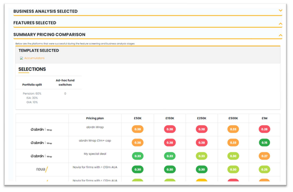
The summary page of our reports now has clear sections which you can collapse or expand as needed.

While the reports still contain the same level of detail, some information has been separated out into appendices – subscribers can choose just to access the main summary page, or the report with all the supporting appendices.
There is also now the option of creating a draft report at the shortlist stage of your due diligence, as well as a final report once your platform panel or chosen investments are locked down.
You can also brand the report with your firm’s logo.
What’s in it for you
The new look reports make it easier to share the outputs from Analyser within your business. This might be with your team, or as part of management information and board reports.
You may also want to share your due diligence reports with clients.
We know that some firms like to make their due diligence reports available to clients on request, either as a way of showing the work they’re doing on clients’ behalf or to reinforce their own firm’s brand.
We’ve also improved the pricing engine that underpins the reports, so that pricing heatmaps are bespoke to your selected platform panel.
One user who saw the changes before they went live says the new look reports and extra functionality represent a “massive leap forward”.
If you’d like to find out more, book a time for a conversation with the team.


